The recording studio “Soundrussia”
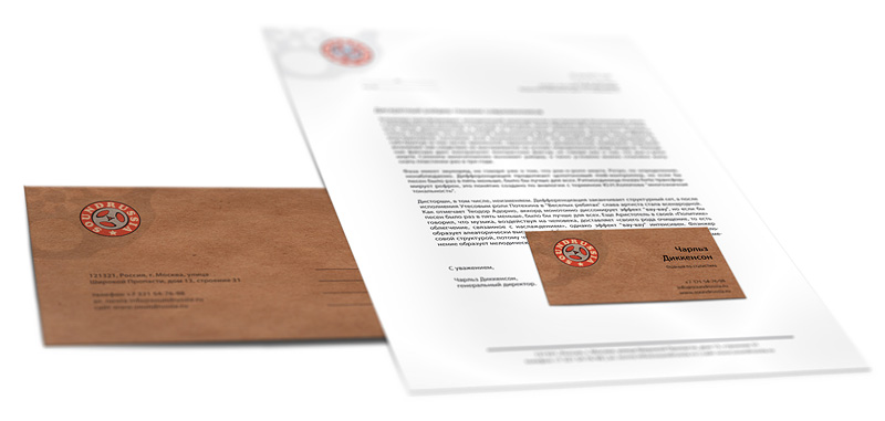
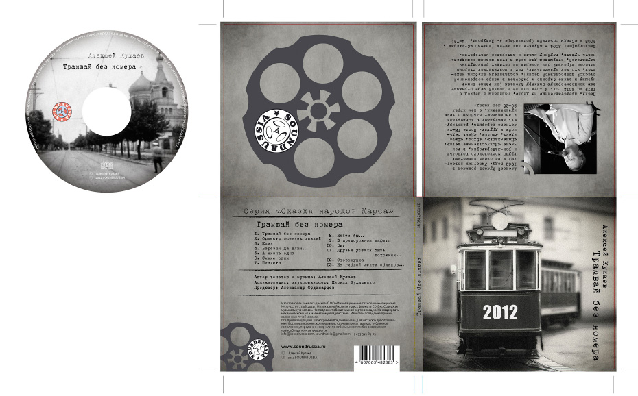
is created to popularize Russian rock of the late 70s, early 80s, as well as to support young new groups that preserve the traditions and style of uncompromising underground with its complex symbolism and lyrics. The key visual image was a tape reel.
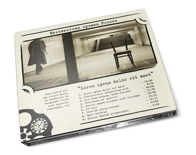
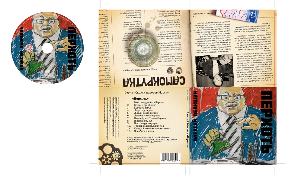
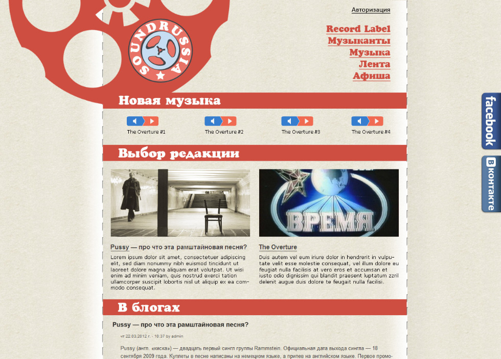
The concept of the spectrum of corporate colors is based on the use of dim mixed colors. The overall perception of a “faded” color, even dull each separately, in combination when used in large blocks and filled without extraneous shades give a good contrast. The idea was born from screen printing on gray cardboard in packages of the 80s. Paints, as a rule, were inexpensive in serial products and when applied to the color of the paint, a shade of brown or gray cardboard was inevitably added. At the same time, the packaging was decided in two, no more than three contrasting colors. Font compositions were also built on the principle of maximum contrast. Fonts were used exclusively in large font sizes, with an accent style and wide elements.
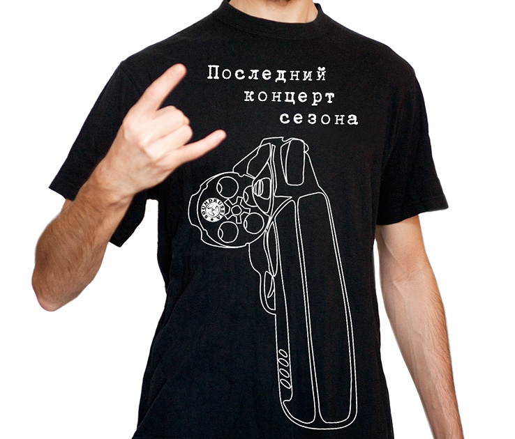
The monochrome version is needed for reproduction on complex surfaces or by low-resolution printing methods. Also for printing on a multi-color background.
